A Design That Anticipates First-Time Visitor Questions
Survey data from the park’s mailing list surfaced consistent uncertainty among prospective visitors.
- Is this space for people like me?
- Will I feel out of place?
- What actually happens at the open house?
- Is this for families, solo visitors, or kids?
- Do I need to register, pay, or bring anything?
These questions shaped the structure of the experience. Instead of burying answers in secondary pages, I surfaced them early and throughout the journey to reduce friction before arrival. Visitor hesitation often happens before any real engagement with content, so the experience was designed around early clarity. Core concerns around belonging, expectations, and logistics were translated into clear “what to expect” sections and lightweight event details to reduce uncertainty and decision fatigue.
Inclusion Through Visual Language
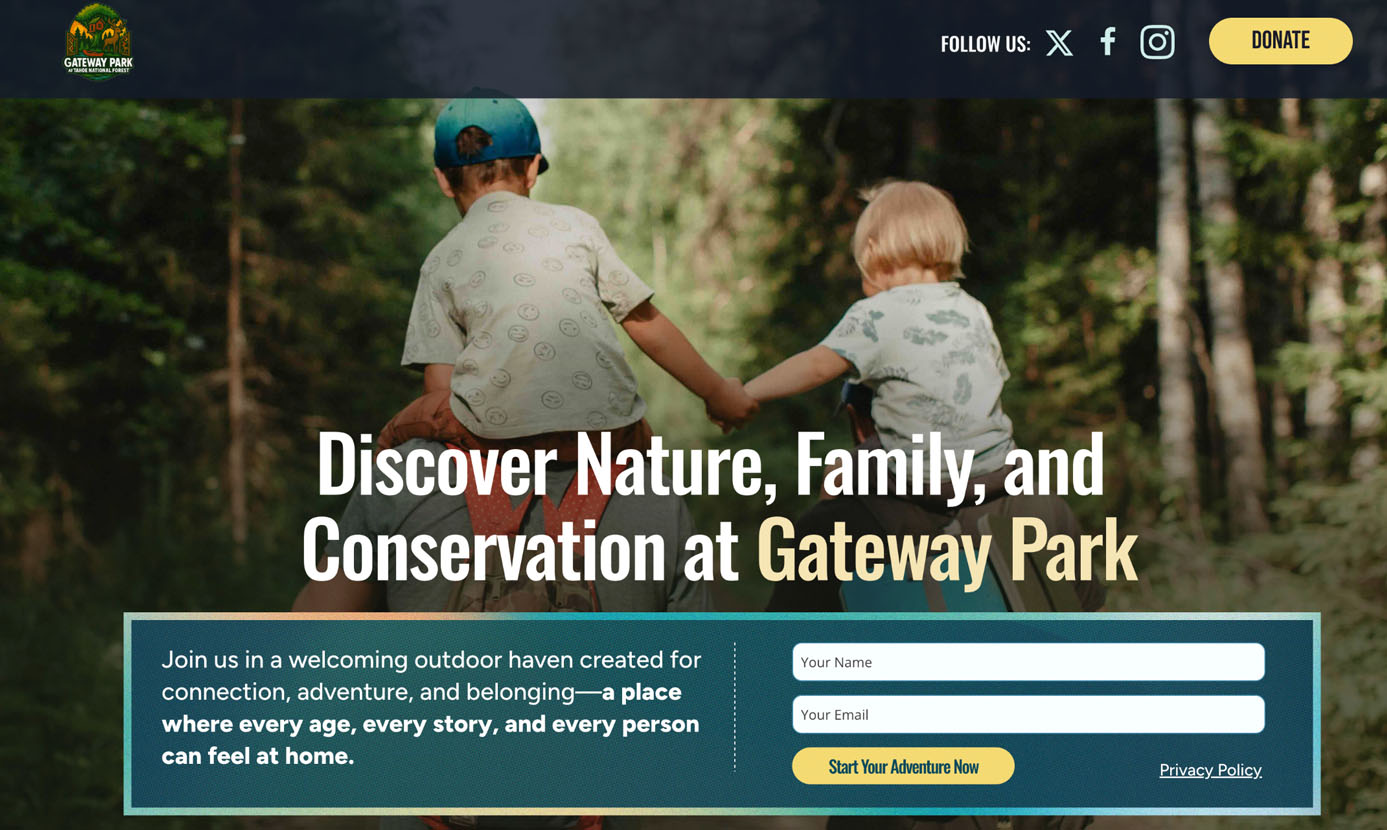
Representation was treated as a foundational framework decision rather than a surface-level visual choice. I prioritized authentic, diverse imagery by combining the park’s existing media library with carefully curated supplementary assets.
The intent was simple: visitors should immediately recognize themselves within the park experience without needing additional context or explanation. This approach also created flexibility in the visual system, with multiple variations that could support A/B testing across landing pages and help guide future creative decisions based on performance and engagement.
Building Reusable Components for Future Campaigns
To support scalability, I created reusable Squarespace blocks that maintain consistency across campaigns while reducing production overhead. This system enables faster iteration while preserving visual and structural coherence across future initiatives.
Designing Social Ads and Email Templates That Scale
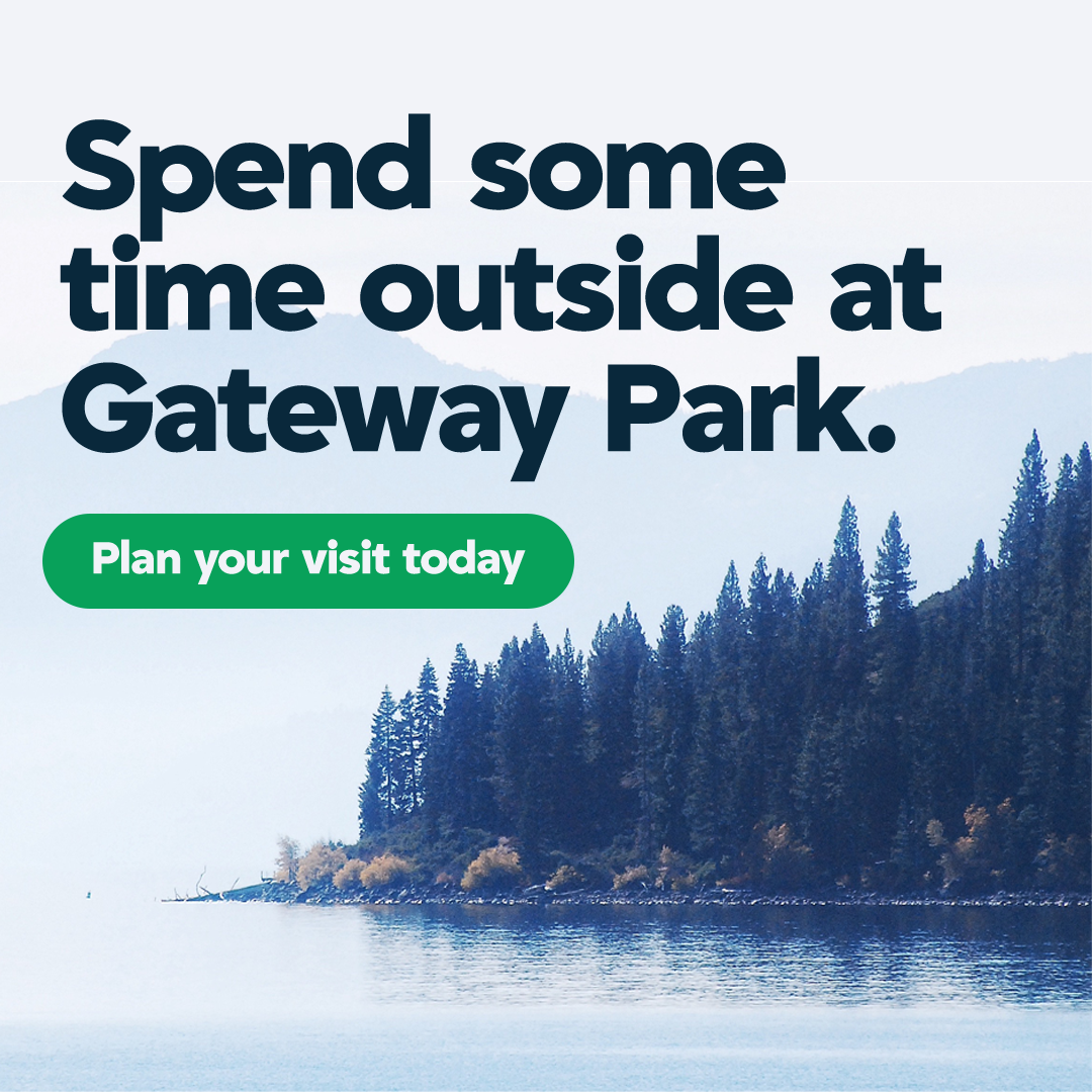
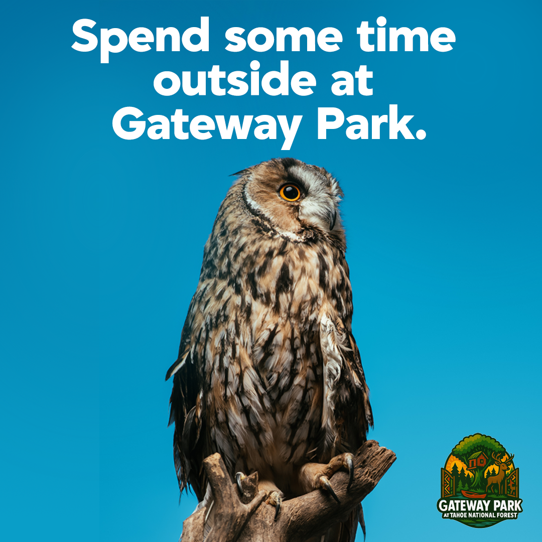
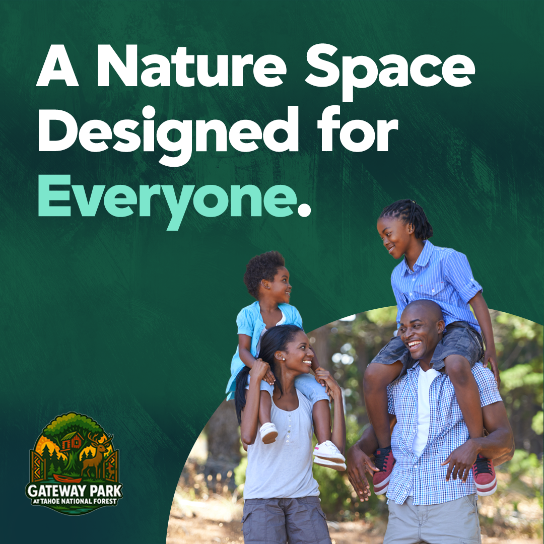
To support Gateway Park’s open house campaign, I designed a set of Meta and social media ads focused on driving awareness while clearly communicating what the events are and who they are for. The main challenge was balancing clarity with attention, especially for audiences with no prior context for the park. The creative direction prioritized immediate comprehension, strong visual hierarchy, and messaging that could stand on its own in fast-moving feeds.
Each variation was built as part of a repeatable system with clear headline hierarchy, human-centered imagery, and concise messaging that addressed core visitor questions quickly. Designed mobile-first, the ads ensured key information was readable within seconds without relying on captions or clicks. Across formats, the goal was consistency without repetition, allowing the campaign to scale while maintaining a cohesive visual language and reducing cognitive load for first-time viewers.
Optimizing the Brand and Logo for Digital Use
Gateway Park’s identity was originally designed for print and static applications, so I extended and refined it for digital environments. This included improving logo scalability, strengthening color contrast for accessibility, and defining consistent rules for typography and UI usage across screens.
The original logo needed refinement for digital performance. At smaller sizes, detail loss and reduced legibility made it difficult to maintain consistency across responsive layouts. Working with the team, I explored refinements that preserved the core identity while improving clarity on screens.
We simplified fine details that didn’t scale well, adjusted spacing for clearer recognition, and tested the mark across mobile, tablet, and desktop breakpoints. We also evaluated contrast across backgrounds to ensure accessibility and consistency across campaign assets. The result is a more flexible identity system that maintains clarity at any size and performs reliably across digital touchpoints while supporting future expansion.
Original Logo
Revised Logo Option #1
Revised Logo Option #2
Revised Logo Option #3
Revised Logo Option #4
Revised Logo Option #4